Use Case - Visual Elements In QML
The Rectangle Type
For the most basic of visuals, Qt Quick provides a Rectangle type to draw rectangles. These rectangles can be colored with a color or a vertical gradient. The Rectangle type can also draw borders on the rectangle.
For drawing custom shapes beyond rectangles, see the Canvas type or display a pre-rendered image using the Image type.
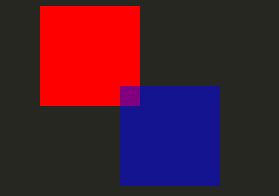
  import QtQuick 2.3

  Item {

      width: 320
      height: 480

      Rectangle {
          color: "#272822"
          width: 320
          height: 480
      }

      // This element displays a rectangle with a gradient and a border
      Rectangle {
          x: 160
          y: 20
          width: 100
          height: 100
          radius: 8 // This gives rounded corners to the Rectangle
          gradient: Gradient { // This sets a vertical gradient fill
              GradientStop { position: 0.0; color: "aqua" }
              GradientStop { position: 1.0; color: "teal" }
          }
          border { width: 3; color: "white" } // This sets a 3px wide black border to be drawn
      }

      // This rectangle is a plain color with no border
      Rectangle {
          x: 40
          y: 20
          width: 100
          height: 100
          color: "red"
      }
  }

The Image Type
Qt Quick provides an Image type which may be used to display images. The Image type has a source property whose value can be a remote or local URL, or the URL of an image file embedded in a compiled resource file.
  // This element displays an image. Because the source is online, it may take some time to fetch
  Image {
      x: 40
      y: 20
      width: 61
      height: 73
      source: "http://codereview.qt-project.org/static/logo_qt.png"
  }
For more complex images there are other types similar to Image. BorderImage draws an image with grid scaling, suitable for images used as borders. AnimatedImage plays animated .gif and .mng images. AnimatedSprite and SpriteSequence play animations comprised of multiple frames stored adjacently in a non animated image format.
For displaying video files and camera data, see the Qt Multimedia module.
Shared Visual Properties
All visual items provided by Qt Quick are based on the Item type, which provides a common set of attributes for visual items, including opacity and transform attributes.
Opacity and Visibility
The QML object types provided by Qt Quick have built-in support for opacity. Opacity can be animated to allow smooth transitions to or from a transparent state. Visibility can also be managed with the visible property more efficiently, but at the cost of not being able to animate it.
  import QtQuick 2.3

  Item {

      width: 320
      height: 480

      Rectangle {
          color: "#272822"
          width: 320
          height: 480
      }

      Item {
          x: 20
          y: 270
          width: 200
          height: 200
          MouseArea {
              anchors.fill: parent
              onClicked: topRect.visible = !topRect.visible
          }
          Rectangle {
              x: 20
              y: 20
              width: 100
              height: 100
              color: "red"
          }
          Rectangle {
              id: topRect
              opacity: 0.5

              x: 100
              y: 100
              width: 100
              height: 100
              color: "blue"
          }
      }
  }
Transforms
Qt Quick types have built-in support for transformations. If you wish to have your visual content rotated or scaled, you can set the Item::rotation or Item::scale property. These can also be animated.
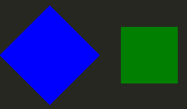
  import QtQuick 2.3

  Item {

      width: 320
      height: 480

      Rectangle {
          color: "#272822"
          width: 320
          height: 480
      }

      Rectangle {
          rotation: 45 // This rotates the Rectangle by 45 degrees
          x: 20
          y: 160
          width: 100
          height: 100
          color: "blue"
      }
      Rectangle {
          scale: 0.8 // This scales the Rectangle down to 80% size
          x: 160
          y: 160
          width: 100
          height: 100
          color: "green"
      }
  }
For more complex transformations, see the Item::transform property.