RadioButton QML Type
A radio button with a text label. More...
| Import Statement: | import QtQuick.Controls 1.4 |
| Since: | Qt 5.1 |
| Inherits: |
Properties
- activeFocusOnPress : bool
- checked : bool
- exclusiveGroup : ExclusiveGroup
- hovered : bool
- pressed : bool
- style : Component
- text : string
- tooltip : string
Signals
- clicked()
Detailed Description
A RadioButton is an option button that can be switched on (checked) or off (unchecked). Radio buttons typically present the user with a "one of many" choices. In a group of radio buttons, only one radio button can be checked at a time; if the user selects another button, the previously selected button is switched off.
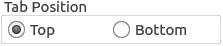
  GroupBox {
      title: "Tab Position"

      RowLayout {
          ExclusiveGroup { id: tabPositionGroup }
          RadioButton {
              text: "Top"
              checked: true
              exclusiveGroup: tabPositionGroup
          }
          RadioButton {
              text: "Bottom"
              exclusiveGroup: tabPositionGroup
          }
      }
  }
You can create a custom appearance for a RadioButton by assigning a RadioButtonStyle.
Property Documentation
activeFocusOnPress : bool |
This property is true if the control takes the focus when it is pressed; forceActiveFocus() will be called on the control.
checked : bool |
This property is true if the control is checked.
exclusiveGroup : ExclusiveGroup |
This property stores the ExclusiveGroup that the control belongs to.
[read-only] hovered : bool |
This property indicates whether the control is being hovered.
pressed : bool |
This property is true if the control is being pressed. Set this property to manually invoke a mouse click.
style : Component |
The style Component for this control.
See also Qt Quick Controls Styles QML Types.
text : string |
This property holds the text that the label should display.
tooltip : string |
This property holds the button tooltip.
This QML property was introduced in QtQuick.Controls 1.7.